Data profiling is the process of examining the data available in an existing data source (e.g. a database or a file) and collecting statistics and information about that data. The purpose of these statistics may be to find out whether existing data can easily be used for other purposes.
Before any dataset is used for advanced data analytics, an exploratory data analysis (EDA) or data profiling step is necessary. This is an ideal solution for datasets containing personal data because only aggregated data are shown. The Social-3 Personal Data Framework provides metadata and data profiling information of each available dataset. One of the earliest steps after the data ingestion step is the automated creation of a data profile.
Exploratory data analysis (EDA) or data profiling can help assess which data might be useful and reveals the yet unknown characteristics of such new dataset including data quality and data transformation requirements before data analytics can be used.
Data consumers can browse and get insight in the available datasets in the data lake of the Social-3 Personal Data Framework and can make informed decision on their usage and privacy requirements. The Social-3 Personal Data Framework contains a data catalogue that allows data consumers to select interesting datasets and put them in a “shopping basket” to indicate which datasets they want to use and how they want to use them.
Before using a dataset with any algorithm it is essential to understand how the data looks like and what are the edge cases and distribution of each attribute. Questions that need to be answered are related to the distribution of the attributes (columns of the table), the completeness or the missing data.
EDA can in a subsequent cleansing step be translated into constraints or rules that are then enforced. For instance, after discovering that the most frequent pattern for phone numbers is (ddd)ddd-dddd, this pattern can be promoted to the rule that all phone numbers must be formatted accordingly. Most cleansing tools can then either transform differently formatted numbers or at least mark them as violations.
Most of the EDA provides summary statistics for each attribute independently. However, some are based on pairs of attributes or multiple attributes. Data profiling should address following topics:
- Completeness: How complete is the data? What percentage of records has missing or null values?
- Uniqueness: How many unique values does an attribute have? Does an attribute that is supposed to be unique key, have all unique values?
- Distribution: What is the distribution of values of an attribute?
- Basic statistics: The mean, standard deviation, minimum, maximum for numerical attributes.
- Pattern matching: What patterns are matched by data values of an attribute?
- Outliers: Are there outliers in the numerical data?
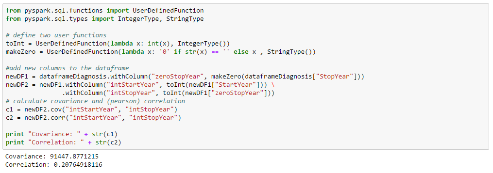
- Correlation: What is the correlation between two given attributes? This kind of profiling may be important for feature analysis prior to building predictive models.
- Functional dependency: Is there functional dependency between two attributes?
The advantages of EDA can be summarized as:
- Find out what is in the data before using it
- Get data quality metrics
- Get an early assessment on the difficulties in creating business rules
- Input the a subsequent cleansing step
- Discover value patterns and distributions
- Understanding data challenges early to avoid delays and cost overruns
- Improve the ability to search the data
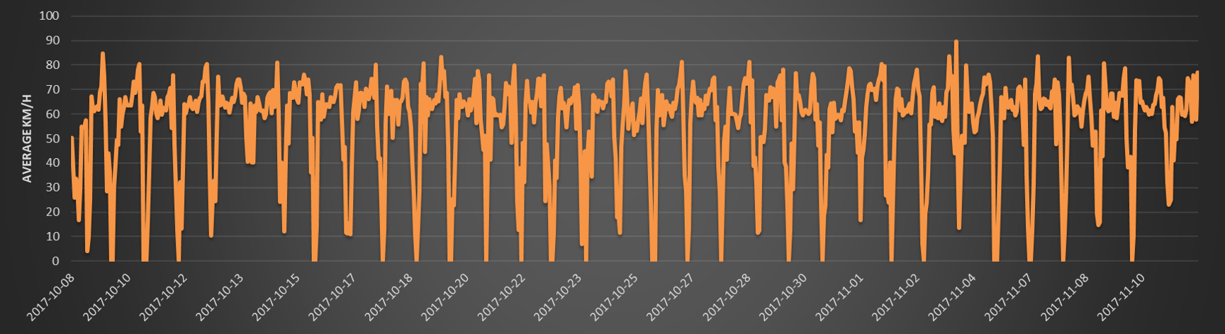
Data volumes can be so large that traditional EDA or data profiling, using for example a python script, for computing descriptive statistics become intractable. But even with scalable infrastructure like Hadoop, aggressive optimization and statistical approximation techniques must sometimes be used.
However, using Spark for data profiling or EDA might provide enough capabilities to compute summary statistics on very large datasets.
Exploratory data analysis or data profiling are typical steps performed using Python and R, but since Spark has introduced dataframes, it will be possible to do the exploratory data analysis step in Spark, especially for the larger datasets.
A DataFrame is a distributed collection of data organized into named columns. It is conceptually equivalent to a table in a relational database or a data frame in R/Python, but with richer optimizations under the hood. DataFrames can be constructed from a wide array of sources such as: structured data files, tables in Hive, external databases, or existing RDDs.
The data are stored in RDDs (with schema), which means you can also process the dataframes with the original RDD APIs, as well as algorithms and utilities in MLLib.
One of the useful functions for Spark Dataframes is the describe method. It returns summary statistics for numeric columns in the source dataframe. The summary statistics includes min, max, count, mean and standard deviations. It takes the names of one or more columns as arguments.
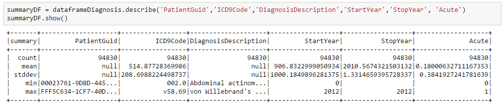
The above results provides information about missing data (e.g. a StartYear = 0, or an empty StopYear) and the type and range of data. Also notice that numeric calculations are sometimes made on a non-numeric field such as the ICD9Code.
The most basic form of data profiling is the analysis of individual columns in a given table. Typically, generated metadata comprises various counts, such as the number of values, the number of unique values, and the number of non-null values. Following statistics are calculated:
| Statistics | Description |
| Count | Using the Dataframe describe method |
| Average | Using the Dataframe describe method |
| Minimum | Using the Dataframe describe method |
| Maximum | Using the Dataframe describe method |
| Standard deviation | Using the Dataframe describe method |
| Missing values | Using the Dataframe filter method |
| Density | Ratio calculation |
| Min. string length | Using the Dataframe expr, groupBy, agg, min, max, avg methods |
| Max. string length | Using the Dataframe expr, groupBy, agg, min, max, avg methods |
| # uniques values | Using the Dataframe distinct and count methods |
| Top 100 of most frequent values | Using the Dataframe groupBy, count, filter, orderBy, limit methods |
This article was orginally posted at : http://www.social-3.com/solutions/personal_data_profiling.php